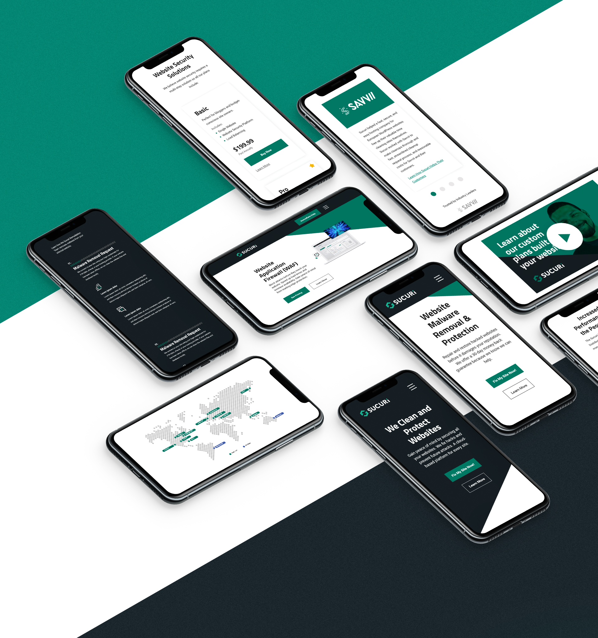
Sucuri Security: Logo and Brand Redesign
The Problem
- The Design and Marketing team proposed to the founders that the logo be redesigned to solve readability concerns. The founders believed the current logo had brand equity and changing it could be negative. To better understand the impact of the logo research was done to collect feedback from users.
The Solution
- Extensive preference testing and user testing helped give the entire team a clear understanding of how people perceived the Sucuri logo. The research convinced the founders to move forward with a redesign.
- Redesigned the logo to solve readability concerns. Removed an obstructive slash and cleaned up wordmark to improve user experience. Also introduced is an icon to promote memorability.
Lessons Learned
- Research and user feedback should always be one of the most important factors in decision-making. The founders pushing us to do research into the current logo led to many discoveries. The entire research process educated us on the brand in several areas.

"Why do we need to redesign the logo?"
It was well known that people had trouble pronouncing the Sucuri name. It was considered a quirky trait of the brand. I was asked to do research on the current logo to determine whether a redesign was necessary. I spent 6 months doing extensive testing to evaluate the positives and negatives of the current logo, which I presented to the Sucuri founders.
The founders were personally very fond of the current logo because it had been around since the company was founded.
They believed the logo had a great deal of established brand equity in the web security community and changing it, without proper data, would negatively impact the brand.

The Challenge
The founders were right. If the current logo didn't have any problems with it and if it was recognized within the community there was no reason to change it for purely esthetic reasons.
So my first job was to go out and understand how people perceived the current logo.

user Interviews
Spoke with users who matched our customer base to understand how they perceived our logo.
I created a screener, with the help of the GoDaddy UX Research team, to filter users to match our specific customer base. In Phase 1, I presented users with the Sucuri logo mixed in with the logos of other website security providers. I asked users to speak to each of the logos describing what they liked and didn't like. In the end, I presented the Sucuri logo in isolation and asked more detailed questions.
This first phase of the testing was done to get some raw feedback from users around the Sucuri logo and logos in general in the website security space.
I ran a total of 3 tests surveying over 60 participants. Users were asked to grade the logo on readability, professionalism, memorability, and personal preference.
In Phase 2, I took all the user feedback and mocked up a logo that resolved many of the issues users had with the current logo. I presented both logos to users and asked them to rate which logo they liked better based on different criteria.

External testing had some very clear findings around the current logo.
In Phase 1, testing clearly showed that the Sucuri logo was one of the least liked logos among other website security company logos. 90% of users expressed issues with readability.
The “Sucuri” name was already difficult to pronounce, but the slash through the logo made it even harder. This was furthermore backed up by all the different ways users were pronouncing the company name. I compiled these video snippets together and later shared them with the founders.
In Phase 2, the mockup logo that solved the readability issue was the overwhelming winner across multiple categories.


user interviews
Veteran Sucuri employees helped shed light on how the brand was viewed in the community.
The marketing team held 1-hour discussions with several key and long-tenured Sucuri employees. We spoke with these team members to be able to understand how they saw Sucuri as a brand today and where they wanted to see it in the future.
These employees have deep ties in the security community so they were able to give us an unfiltered view of how the brand is perceived in these spaces.

We will return after this brief intermission...
I presented all the research to the founders and they approved us to move forward with exploring a logo redesign. Which was great, but I wouldn't be able to work on it. I'd received an opportunity at a new company and the offer was very hard not to accept. I felt absolutely terrible leaving just as we had gotten the approval, but the leadership at Sucuri was so phenomenally understanding.
To my surprise (and quite frankly honor), the Sucuri team reached out to me a few months later and asked if I was hoping to work on the logo redesign as a freelancer. I was enormously excited to get the opportunity to continue the work I had started.

Design Process
Explored several ideas with the team and tested to narrow down the selection to the best option.
Working in close collaboration with the Sucuri leadership team we conducted additional user testing to help arrive at the final design.
The leadership at Sucuri wasn't very fond of common security iconography. Like a shield or checkmark. They wanted something completely ownable and unique to Sucuri.

The Solution
The new logo solved the issue of readability. Presenting the company name in a clear easy to read typeface. An icon was added to make the logo more ownable and the only design flair to the wordmark was to the “i” on the end.


Logo Structure
The “Lockbox” was added to help make the logo more memorable. User testing showed that adding an icon to the logo increased memorability by 60%.
The “Lockbox” was designed to embody the strength and security that Sucuri is own for. There is also a subtle “S” created by its form to draw an association to the Sucuri name.


